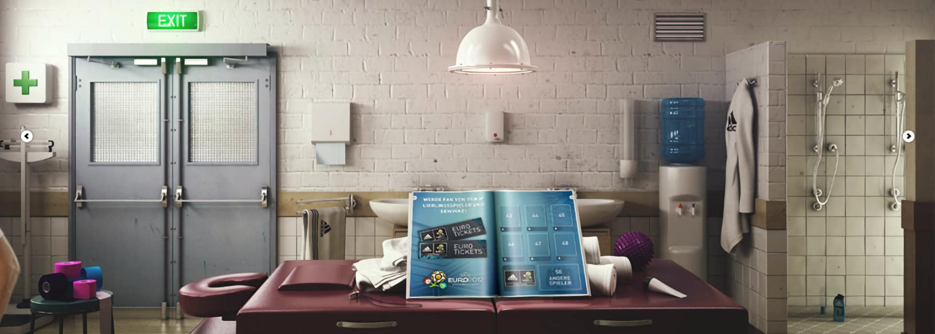
Context
As an UX Architect I worked together with a huge team at TBWA Berlin to create an app for Adidas to promote their newly launched fitness tracker miCoach and the German national soccer team's jersey.
Problems
- Many stake holder, participating companies, and team members without a clear product lead.
- The campaign was German but many team members were from UK and only spoke English.
- Creative directors with a lot of brand expertise but lacking technical support.
- A campaign idea lacking details that could be transformed in a fun to use app.
Solutions
I could add vital elements that helped launching a successful app. To mention a few of those:
- I proposed to create a bilingual documentation to communicate the app's architecture and interface which was approved. I constantly added or revised relevant information. It was shared amongst client, team, and external companies.
- I contributed gaming mechanics that transformed the static campaign idea into a digital challenge for the users.
- I created user flows, wireframes, and sitemaps as a working template for designers and copywriters. Later on those elements were also used by the developers.
- I provided UX copywriting for an easy to use interface.
Deliverables
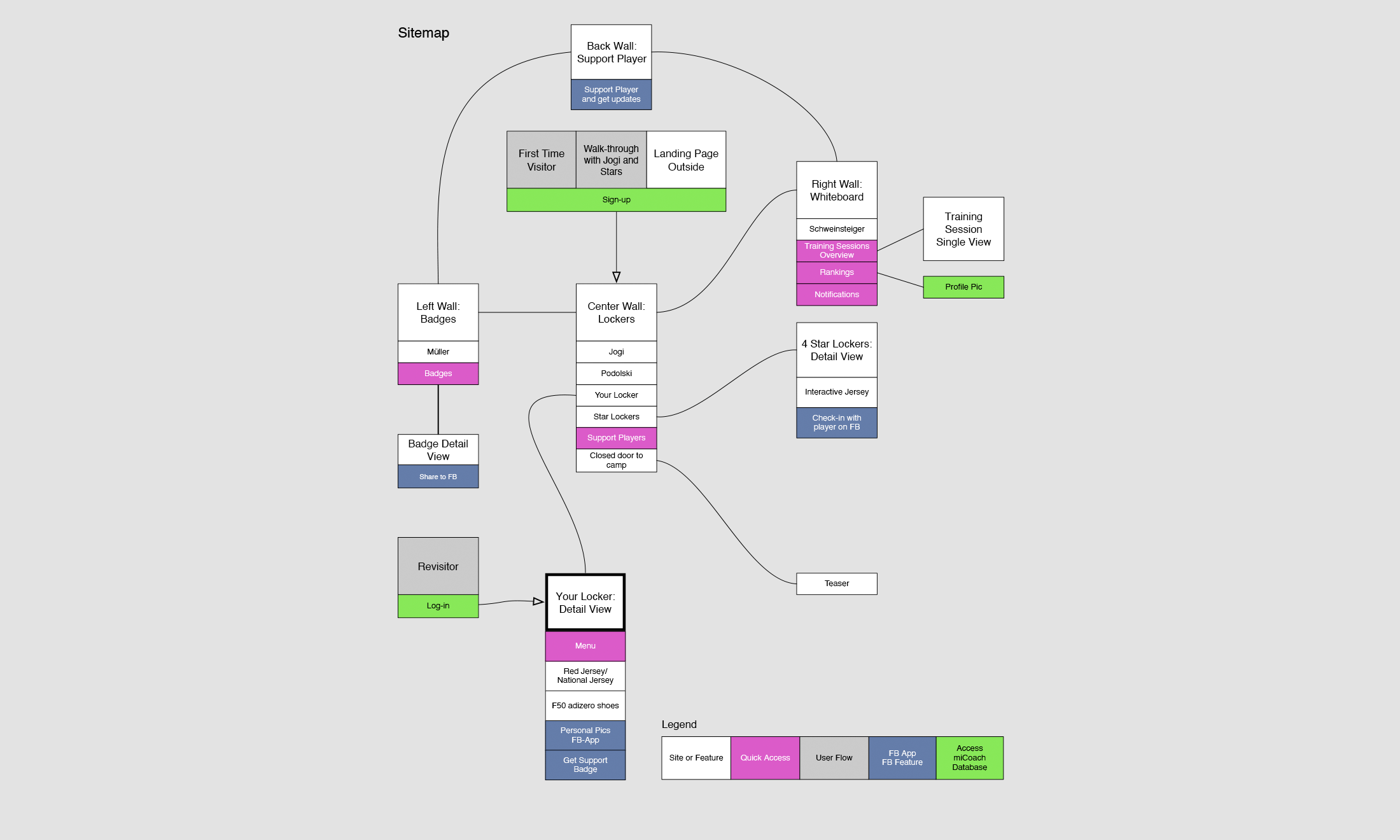
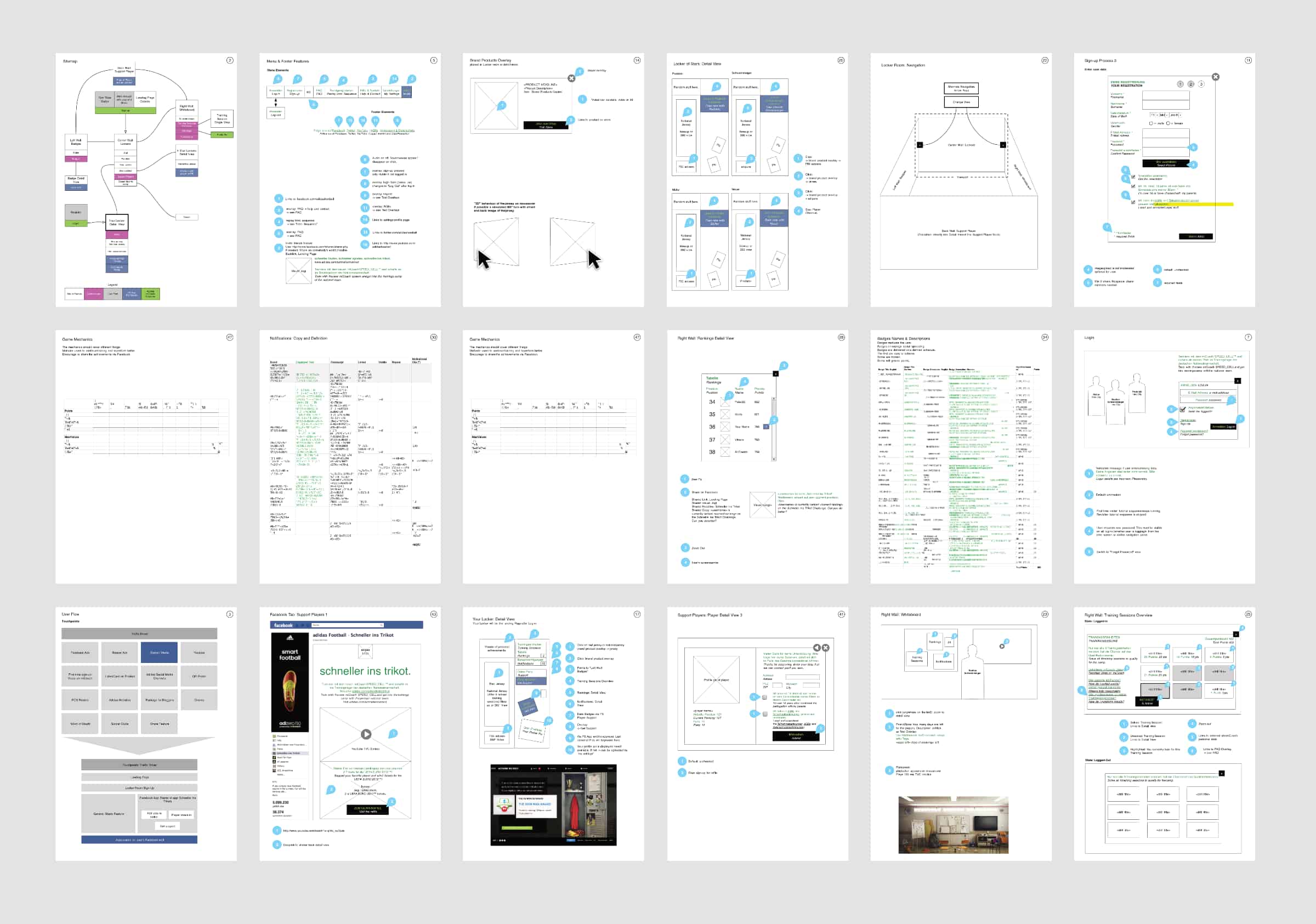
Impressions of the Final Adidas Campaign App
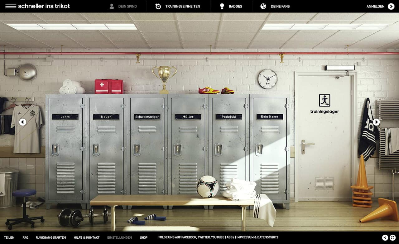
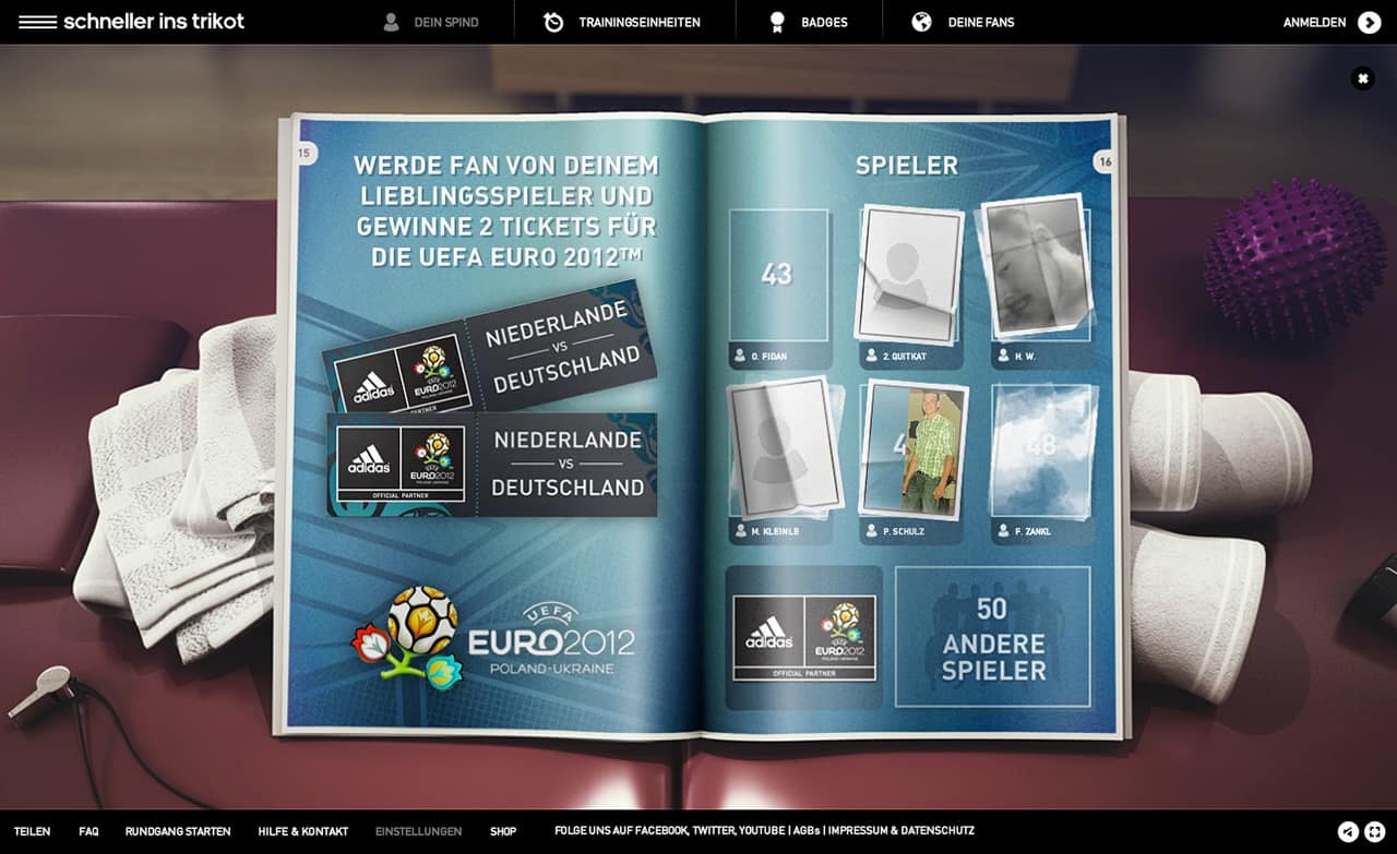
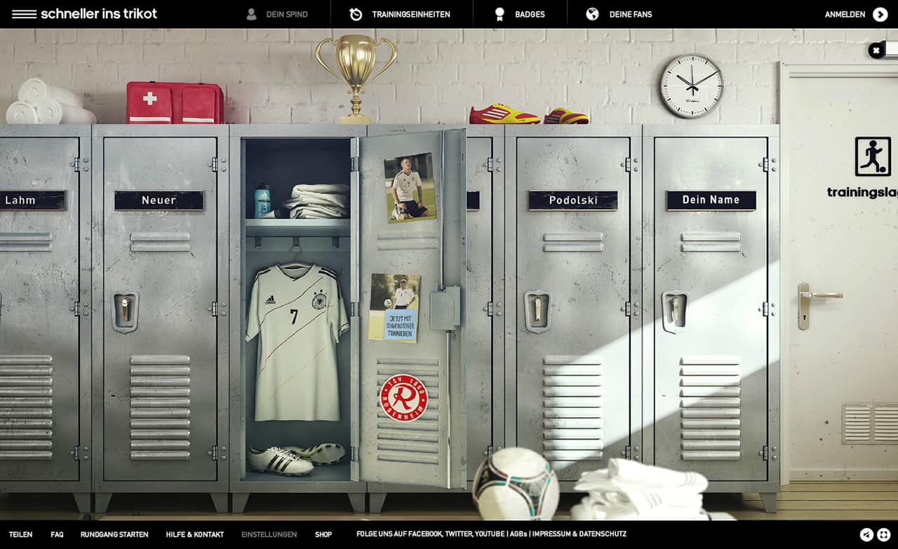
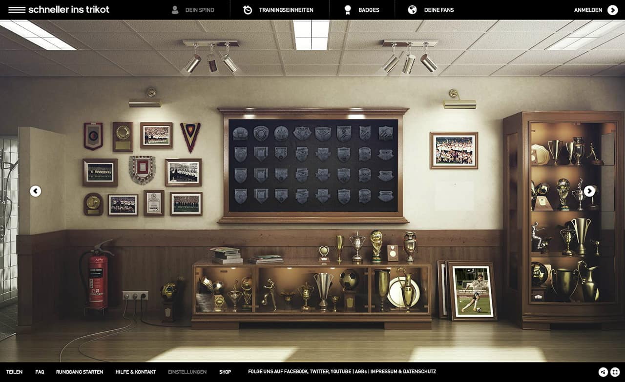
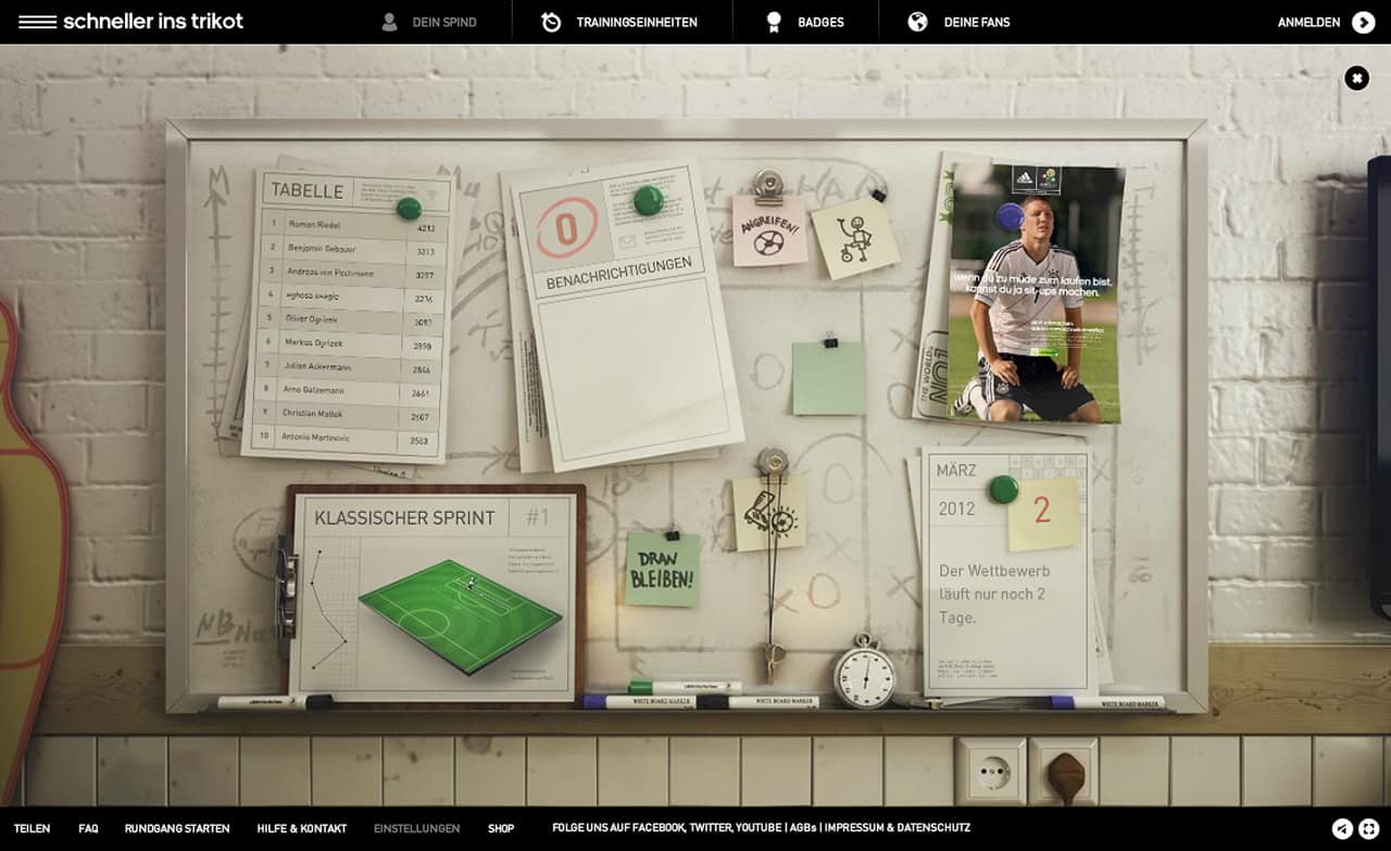
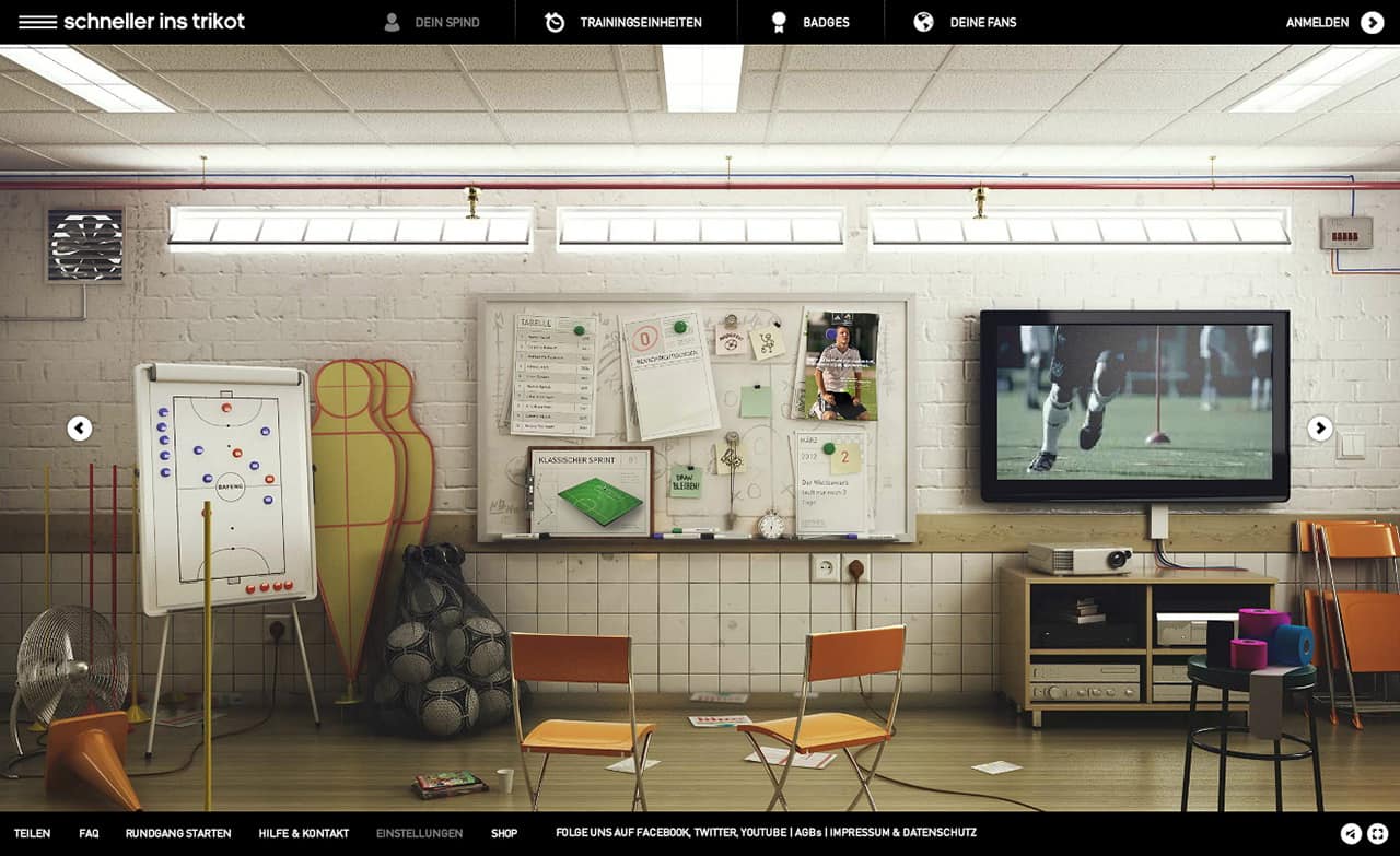
You can find many more infos, videos, final artworks, and the campaign on Lucio Regner's page who was one of the creative directors. Studio Aiko provided the 3d models and renderings for the locker room as the central part of the app's UI.


