Thomann is an online retailer specialized for musical equipment serving millions of customers each year. I started working there in 2013 as a remote freelancer building a remote team of designers and product owners.
Core Problems
- Rising number of mobile users had no mobile optimized shop.
- An app was demanded through various feedback channels by hardcore users.
- A very small dev and design team gave only limited possibilities for improvements.
- No documentation or design system was available.
Solutions
As all of the mentioned problems above are connected I provided a couple of measures to find a permanent solution. I do not claim ownership for the technical aspects. Pretty much everything else was in my responsibility:
- Research to provide a solid base for a product roadmap.
- Product roadmap to have a shared vision within the teams. This evolved from handwritten notes over a Jira pipeline to a custom-tailored Kanban board.
- Recruitment of a UX team and product owners.
- Launch of a responsive mobile website.
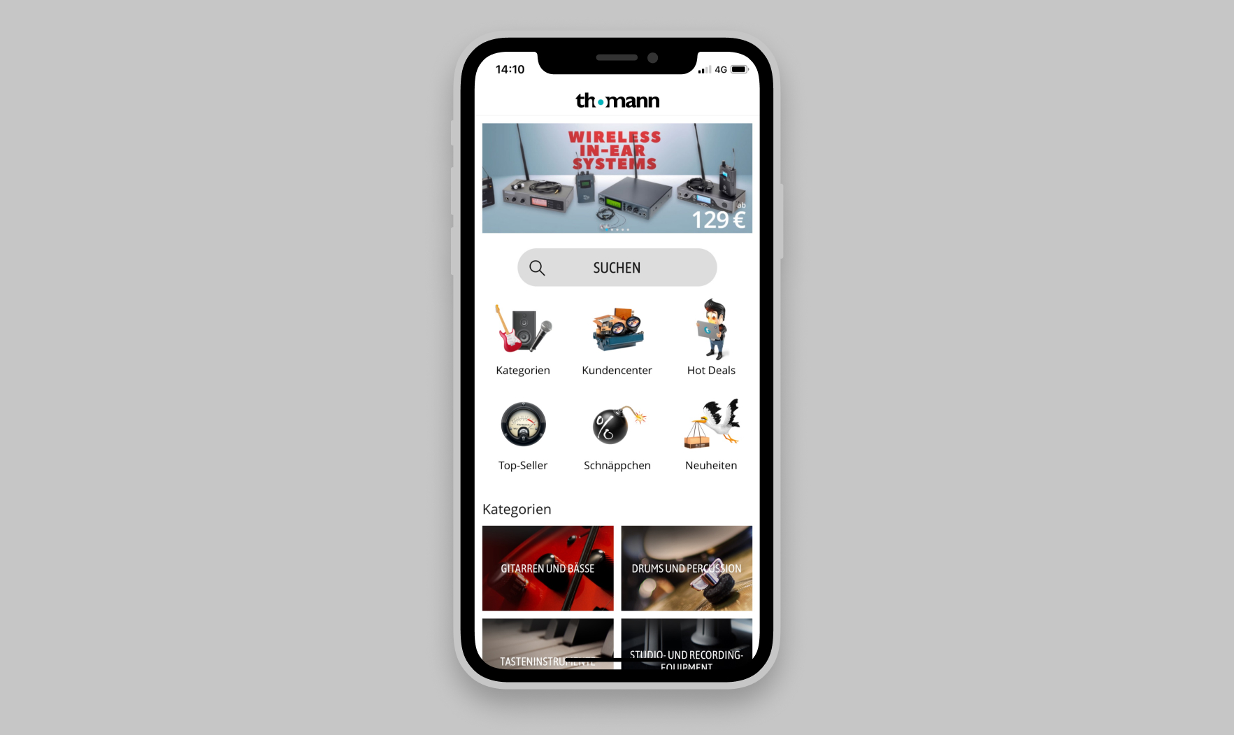
- Launch of an iOS and Android app.
- Transformation of the desktop website to a responsive website.
- Iterative improvements from 2013 until 2019 of all the things mentioned above.
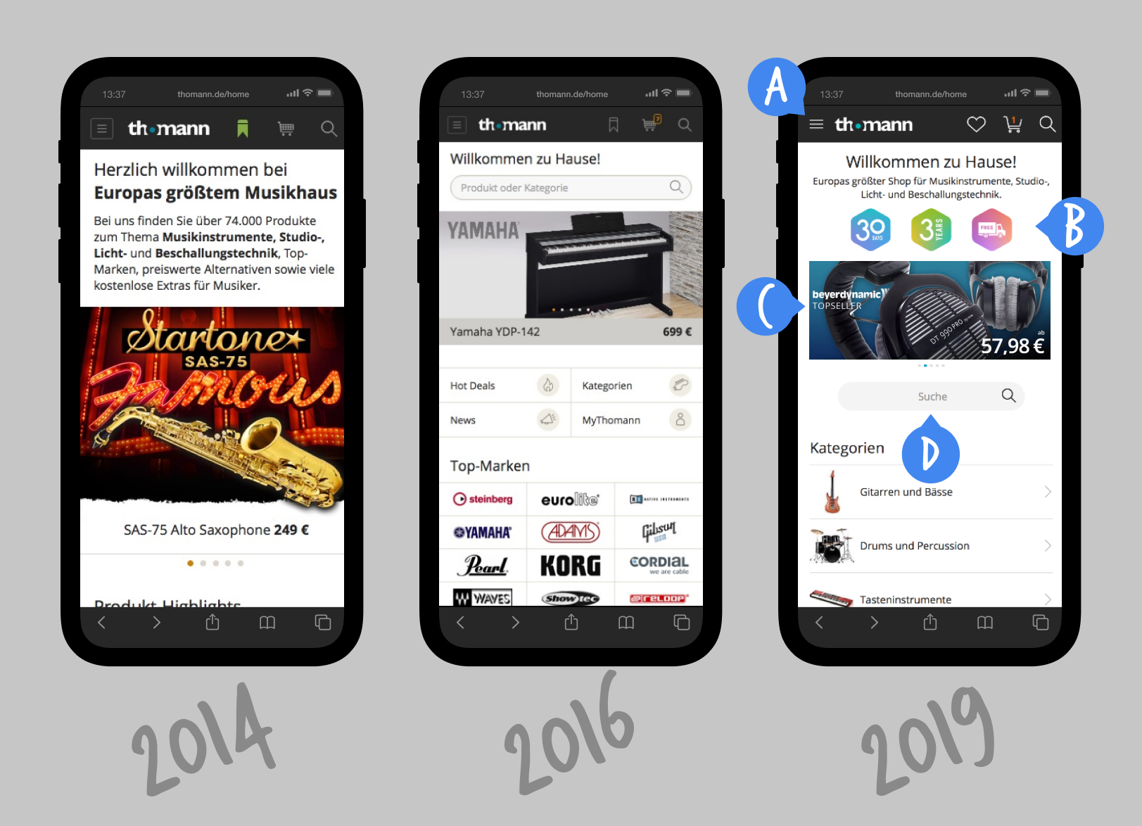
Iterations of the Mobile Website's Home Screen

A. The menu icon was modified in color, dimension, and outline based on the results of a multivariate test in VWO.
B. Main USPs were visualized with badge icons in mobile and desktop. Hundreds of scribbles and style variations were tested until this finalized and size optimized version.
C. The media gallery consumed too much vertical space. It's size was reduced to show additional content above the fold.
D. The search field was moved towards the user's thumbs for for easier accessibility.
Tremendously Positive Feedback From Users

Thomann App Stats 2019
| Platform | Rating | Installs | Link |
|---|---|---|---|
| iOS | 4.9 ⭐ | 500k | App Store |
| Android | 4.9 ⭐ | 500k | Google Play |
User Quotes
I should never have installed the Thomann-app. You also sometimes lie in bed and then suddenly bought a new microphone, right? RIGHT? – Daniel Wallace via Twitter
Complete success on the Thomann app icon. Brutal!!! Its up to eleven!!! – MilFuegos via Twitter
Very slick, professional and easy to use App. – Ricey81 via iOS AppStore
Love this app i just buy too much music gear now – Wayne via Google Play
The app is perfectly laid out and easy to navigate and Thomann’s service is second to none. Like many Brits I don’t want to leave the EU and I will be devastated if Brexit affects my Thomann experience. – Mart via iOS AppStore
Really easy to use – Jesse via Google Play
Image Copyrights
Hero Image by Amin Hasani
Screenshots & Designs by Thomann


