
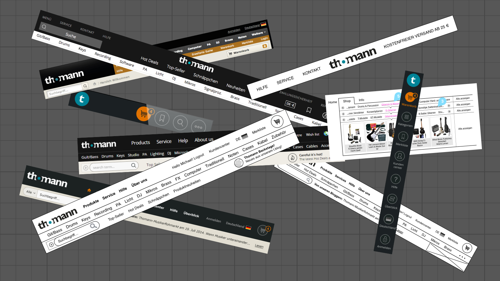
I was responsible for the responsive redesign of the entire online shop Thomann.de including mobile and app for iOS/Android. In this article, I show a tiny extract of solved problems in the header area of the desktop shop.
Context and General Conditions
- The header consists of elements such as logo, search, USP, main categories, customer center, and wish list.
- All customizations must work in 16 different languages.
- Changes to the header have to be made with great care. They have a huge impact on the perception of the brand. Adjustments are visible at the most prominent point within the entire browsing and selling process.
- Careless changes can cause a loss of existing customers.
- The desktop shop covers devices from small tablets (e.g. iPad Mini) to large screens. It is used by users with PCs, laptops, phablets, and tablets.
- For technical reasons, a full-responsive solution is excluded. However, this restriction is unproblematic from the customer's perspective, as a mobile-optimized site for small displays is delivered.
- Vertical space is particularly valuable in e-commerce. The header pushes important content such as product pages down. This can lead to page exits.
Rough Overview of Various Problems
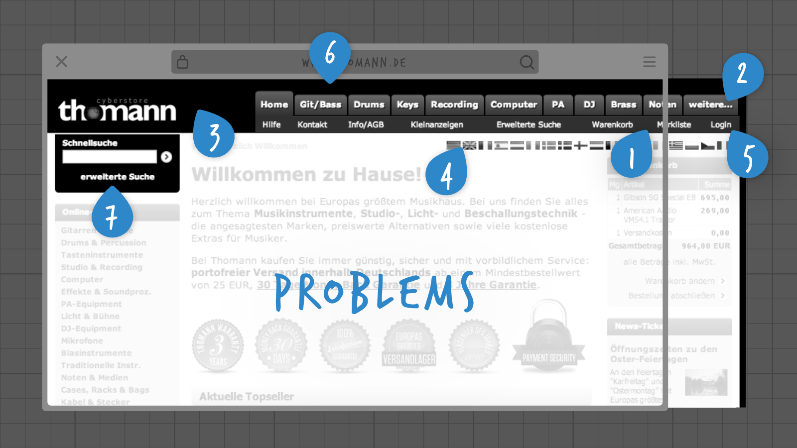
- No visual highlighting of conversion-relevant elements such as shopping cart or wish list.
- Categories are hidden behind a tab "weitere..." (German for "more...") to save space.
- The logo appears unstable and the branding suffers from missing typographic white space.
- No option to flexibly choose the country of delivery, language, and currency.
- No reference to the customer center.
- Missing references to guarantees and shipping conditions.
- High space demand of the search feature with an unfavorable small input form.
- Dozens of others that would go beyond the scope of this page. :)
The Solution
In the following subsections, the process from thesis to technical implementation is described. For this purpose, I choose point 2 from the list above.
Thesis and Causes
Because not all categories are directly visible in the header, we do not show the entire product range to the user. That's why there are fewer additional sales within these categories.
This thesis arises from my observation of Thomann's shop and the competition. To find out if the statement is true or false it should be checked later. For this purpose it's helpful to identify possible causes:
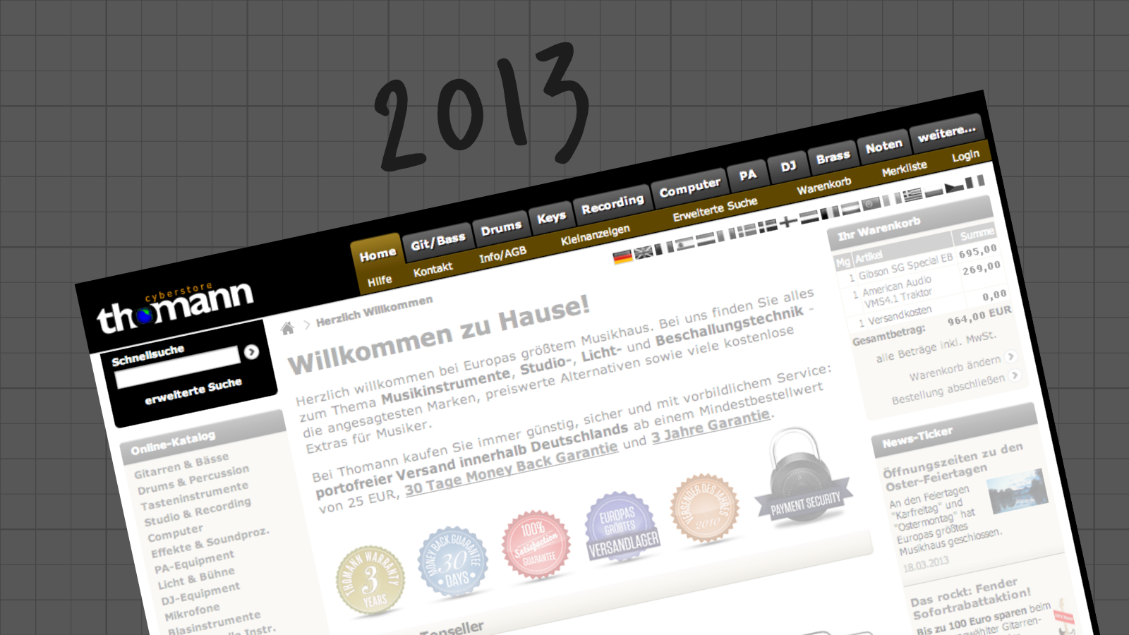
- Three categories (cases, cables & accessories) are hidden behind the tab element "weitere..." (German for "more...").
- The browser width is narrower than the screen width for some users. For example, when two browser windows are positioned side by side.
- More categories are hidden in other languages like Finnish.
Thesis Verification
Do we have a problem? These steps have been taken for verification:
- The measurement is based on this hypothetical cause: The browser width is narrower than the screen width for some users.
- The "Noten" (German for "Sheet Music") tab is selected for a quick comparison.
- Within Google Analytics I check whether users with browser widths below 790 px click "Noten" less frequently.
- Comparing whether the visibility of the tab "Noten" has a direct impact on sales.
- Points 3 and 4 are true: we have a significant hit.
Therefore I decided to develop solutions to the problem to improve it sustainably.
Solutions
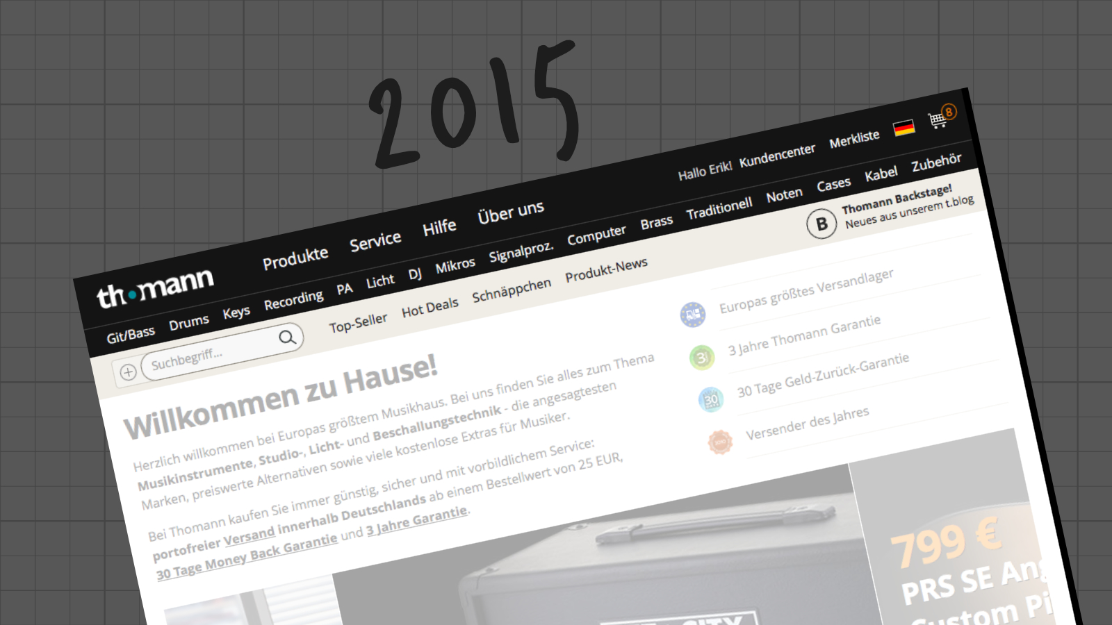
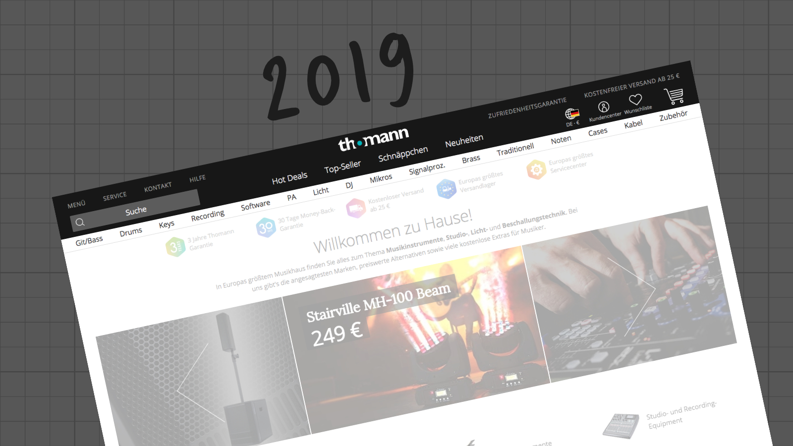
In the years 2013–2019 hundreds of scribbles, wireframes, final artwork, and dynamic prototypes will be created.
Now the creative phase begins. What can be done to contain the problem while keeping the basic conditions mentioned before? The solutions have been defined over several project phases in wireframes, visual designs, prototypes, and also Jira tickets. In retrospect, it's very clear which decisions contribute to the solution of the problem:
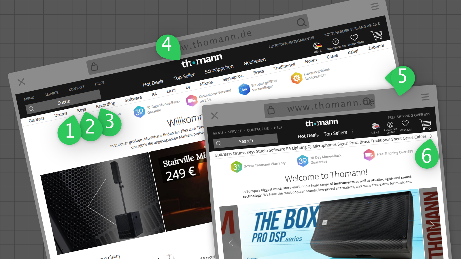
- A narrow running font needs less horizontal space.
- Just text requires far less space than a tab element.
- The categories are given the full width of the page, meaning a complete line. This costs space but improves cross-selling in the previously hidden categories
- The "Home" tab is removed. It's redundant to the click on the logo.
- Dynamic width through a responsive design. Font sizes and elements adapt freely. The most important elements are always visible. Categories are only hidden on the right in very narrow views.
- The tab element "weitere..." (German for "more") costs a lot of horizontal real-estate and is replaced by a > icon.
Implementation and success measurement

Screenshot of the Online Store
The solutions mentioned above have all been implemented alongside hundreds of others. This happens step by step and building on each other iteratively. This minimizes the risk of confusing or losing customers and risking a drop in sales. When changing the font, users with older browsers were kept in mind who have problems displaying web fonts. The impact on sales conversions is generally important. Micro-conversions such as simply clicking on a category are secondary. The bottom line is that sales and clicks on the categories that are now visible have increased.
Future Outlook
Elements such as categories and subcategories take up a lot of space. This space is always limited and should be used as efficiently as possible. I am proposing a follow-up thesis:
The user is not provided with the most relevant categories within the header element.
Personalization of the order or visual prioritization could help here:
- Perhaps other categories are more popular in third countries (China, Switzerland, USA) than in the core markets (EU).
- You know the favorite categories of registered customers and could put them in the foreground.
- If a user is on a product page (e.g. a specific guitar), cables and cases may be more important than drums in this context.
- Maybe there are situations in which you can completely hide the categories because they are never accessed by users.